UXUI CASE STUDY
Boosting Retention & Engagement:
Solving Drop-Off
BACKGROUND
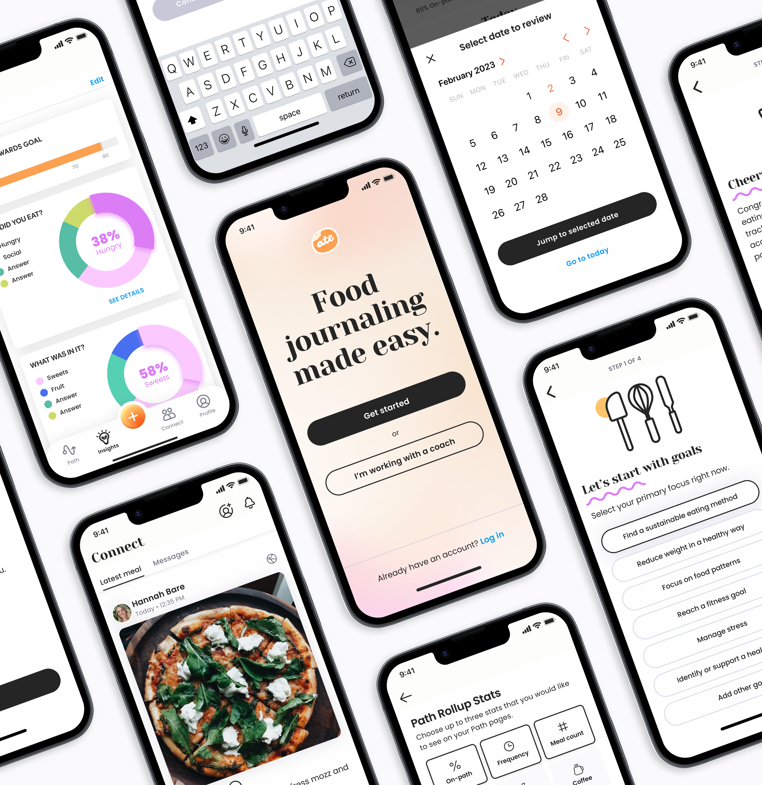
Ate is a food journaling application that helps users effortlessly monitor their food intake through photos and topics aligned with their personal goals. Many people rely on food tracking tools like Ate to establish new dietary habits or maintain existing eating regimens. To encourage engagement, Ate offered users a complimentary 7-day trial of the app.
PROBLEM
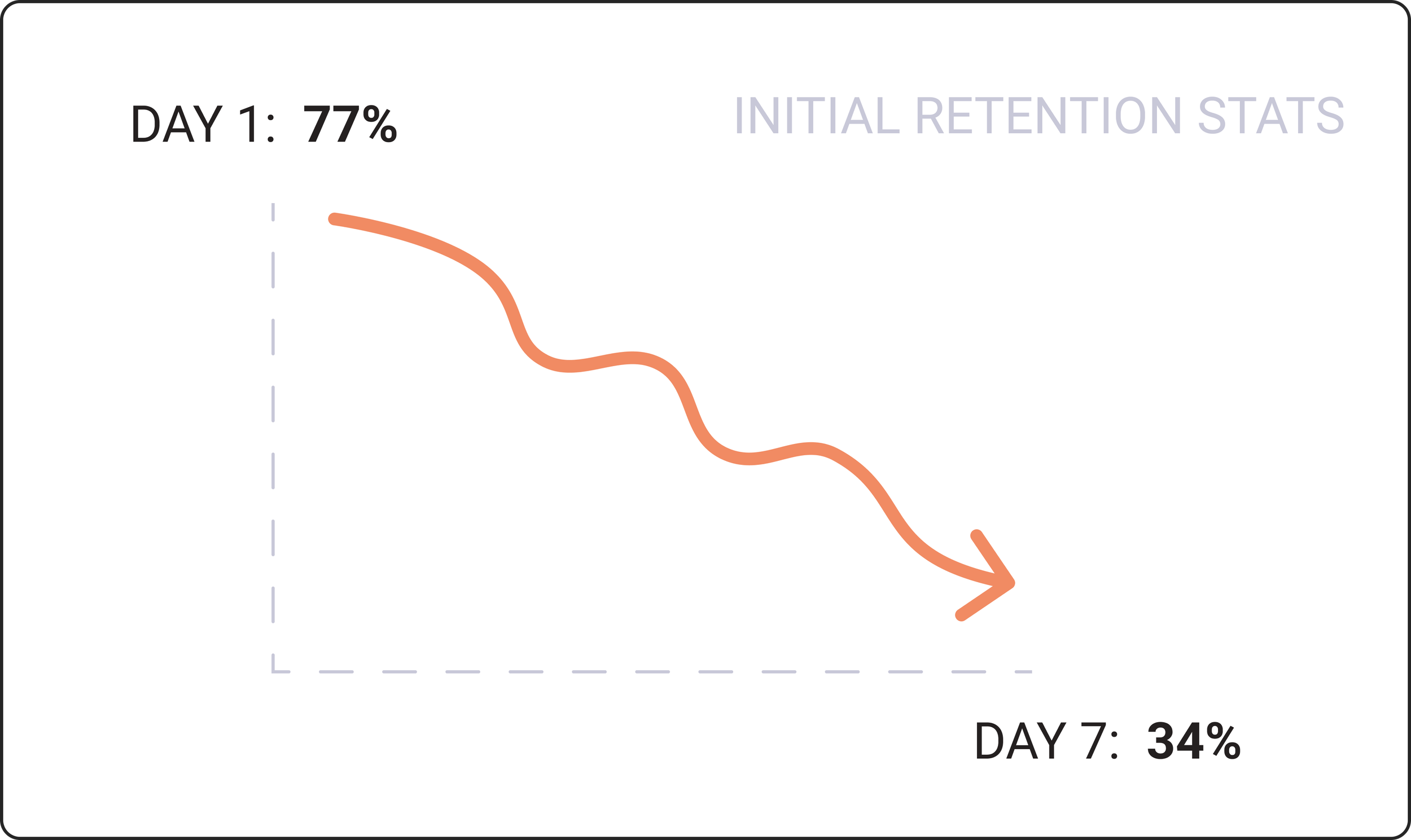
At the time of this project, only 34% of new users continued using the app beyond the initial 7-day trial. This low retention rate highlights a challenge in sustaining user engagement after the trial period.
OPPORTUNITY
This retention gap presents a significant opportunity to enhance user engagement strategies, ultimately boosting customer retention and ensuring long-term adoption of Ate’s food journaling tools.
“Users try a lot of apps, but decide which [app] they want to stop using within the first 3-7 days... The key to success it to get the users hooked during that critical first 3-7 day period.”
— Ankit Jain, serial entrepreneur
My role
Project planning & management
Research, ideate, feedback & iterate
Create high fidelity wireframes for dev team
Timeline
Total: 3+ week project
Early investigation (June)
Week 1-2: Explore + ideation (August)
Week 3: HI-FI designs
Team
1 designer, me
1 mobile developer
1 stakeholder, CEO
Tools used
Figma - mindmap, designs
Google Forms - user research
Zoom - communicate with participants
ClickUp - tasks mgmt & communication
The problem?
66% of new users leave the app after 7-day free trial

Ate's onboarding process can be summarized in two phases:
Initial Onboarding: During this phase, users are taken through a series of screens where they input their name and intentions. This is followed by several screens containing standard legal information.
Inside the App: After completing the entire onboarding process, users gain access to the app's interior.
The current challenge isn't isolated to these individual phases; rather it encompasses the entire user journey and how people feel about it. It also hinges on the fundamental understanding of why users are using the app and whether we are effectively aiding them in achieving their goals.
My solution?
Streamline, personalize + support progress
My hypothesis aims to enhance user engagement and retention by focusing on three core strategies: personalization, enjoyable learning experiences, and goal alignment.
Personalization: tailor the app to individual preferences, boosting relevance.
Fun learning moments: including gamification, maintain user engagement.
Clear goal alignment: add milestones and feedback, strengthens user purpose.
These changes are expected to increase user commitment and reduce churn. To validate my hypothesis, I conducted user research and analyzing key metrics.
My ux design process

Understand the problem

Explore ideas

Create final design
Keep reading —
for a deep dive into the case study

STEP ONE
Understand + research
the problem
During this three-week project, significant effort went into comprehensive research.
This encompassed gathering quantitative data from analytics tools, revisiting past survey and interview data, consulting UX experts' best practices, conducting a heuristic evaluation of our software, and completing a seven-day qualitative research study with participants.
DATA GATHER__________
User persona
Building upon prior research conducted in previous months, we had already established a solid understanding of our "Emphatic Users" – individuals who deeply appreciated our product and remained dedicated users.
Analysis: These predominantly comprised younger Millennials and older Gen Zs residing in urban areas, demonstrating proactive engagement with their health and well-being who had challenges staying consistent to their goals.

2. Data analytics
Ate uses Mixpanel for most analytics. I wanted to see the engagement patterns of new users within their first 7 days, within the last 30 days. Below are the first 4 days.
Analysis: Users dwindle off of the platform from 77% to 34% (within the last 30 days). This is a fairly large churn rate.

A. Heuristic Markup (Leah Buley) intuitive questions
Everything is blank at first, it’s not very intriguing yet
What do I do when I arrive?
I’m not in front of my meal
What does “on/off-path” mean?
B. Heuristic Analysis (NN/g) areas of concern
Present feedback to users ASAP, ideally immediately
Use familiar words + phrases
ID emergency exit in all states
Use words consistently (focus, goals, etc)
Users should not have to remember info from one part of the UI to another
Humans have limited short-term memories.
Offer help in context instead of long tutorials to memorize
Hide shortcuts from novice users, but can speed up the interactions for the expert users
Allow users to tailor frequent actions
Provide personalization by tailoring content and functionality for individual users
Allow for customization, so users can make selections about how they want the
product to work
Each screen + flow should focus on the essentials

3. Current app Heuristic Markup
To gauge our starting point and identify potential obstacles, auditing the current flow is crucial. I performed an initial Heuristic Markup audit following Leah Buley's "The User Experience Team of One," and a standard 10 Usability Heuristic evaluation in line with NN/g's best practices.
4. Industry best practices
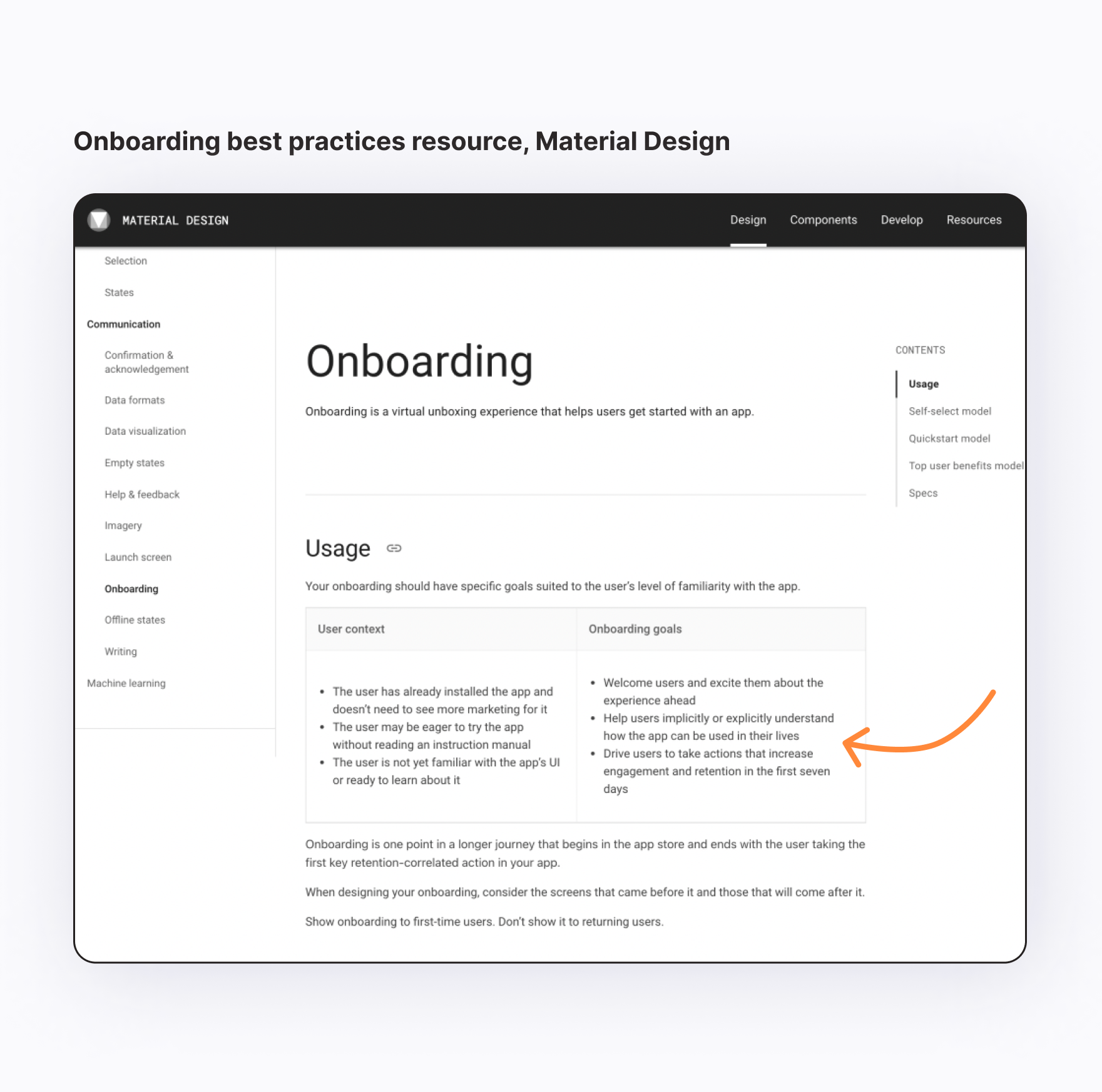
The leaders in product design, development, and documentation are Apple's HIG and Google's Material Design. When using these two resources as references, common themes to consider when creating a new onboarding experience emerge:
Welcome users and excite them.
Teach users how to integrate it into their daily lives.
Ensure onboarding helps the users set up the app and enjoy using it.
Support users in taking swift actions to drive engagement and retention.
Put simply: Prioritize simplicity
5. Gamification principles
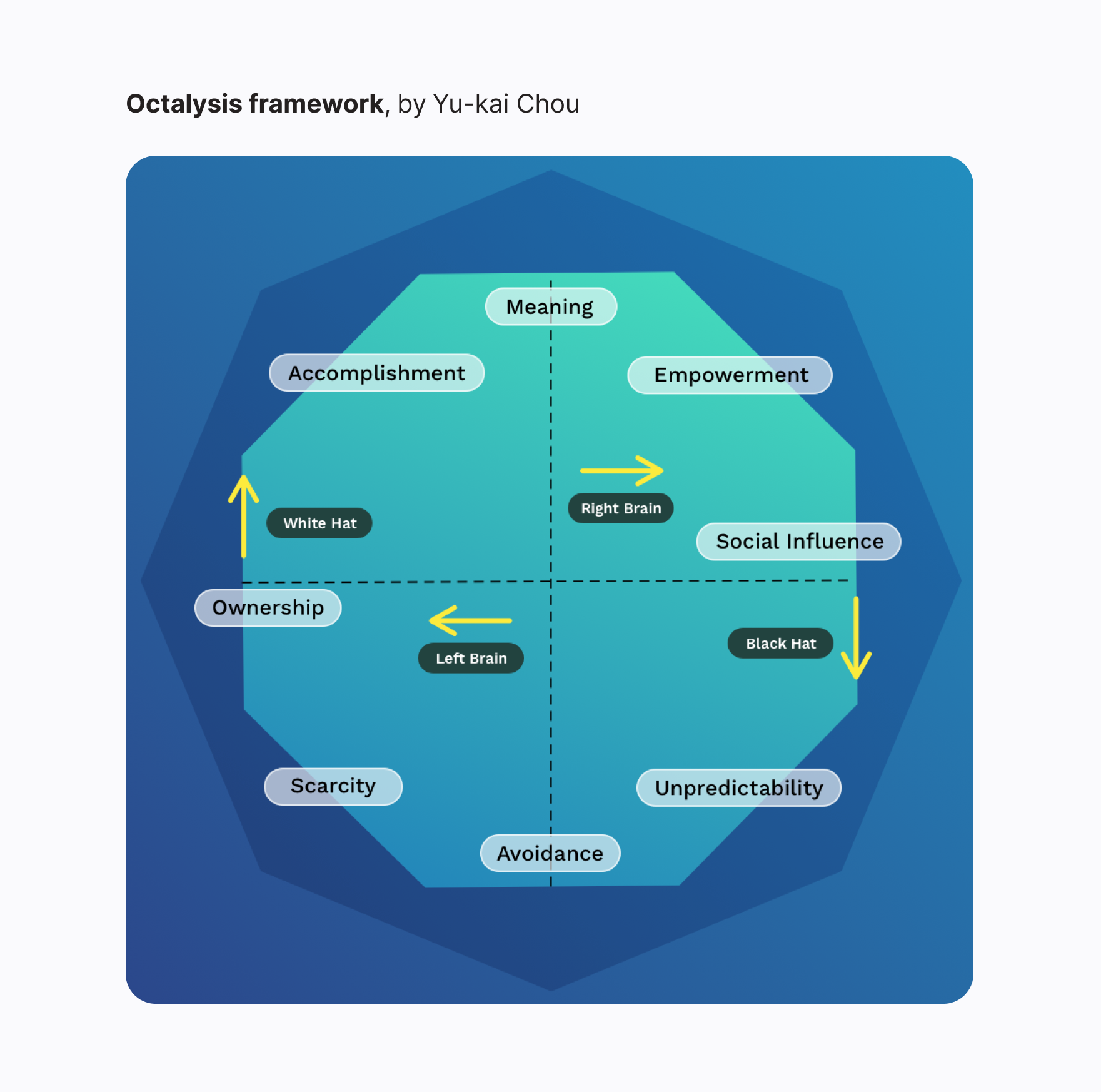
I delved into gamification, a strategy that leverages game elements to boost human motivation, with a specific focus on utilizing Octalysis, a framework created by Yu-kai Chou. Octalysis comprises 8 Core Drives represented by an octagonal structure.
My findings indicate that by enhancing our users' "Development & Accomplishment" desire they will naturally be motivated to improve, as demonstrated by the Nike Fuel Band. Importantly, our brains favor short-term gratification, making it vital to incorporate and celebrate short-term achievements and progress in our design approach.
6. Consistency research
Based on our spring 2023 user research, we found that Emphatic Users mainly rely on our tool for uphold consistency in pursuing their food-related goals. This led to a deeper exploration of consistency, prompting questions about habit formation, maintaining consistency, strategies for overcoming challenges, and progress tracking. Our research revealed key insights for achieving consistency, such as:
Explore motivations and set small, reachable goals
Track without judgment
Celebrate progress and positive developments
Utilize reminders for mealtimes
QUALITATIVE RESEARCH__________
“A diary study is a research method used to collect qualitative data about user behaviors, activities, and experiences over time.”
— Neilson Normal Group (NN/g)
Selecting a research method: Diary Study
I chose to conduct a Diary Study for deeper insights into initial app impressions, potential usability issues, and common frustrations over extended app interaction, compared to one-time interviews or tests.
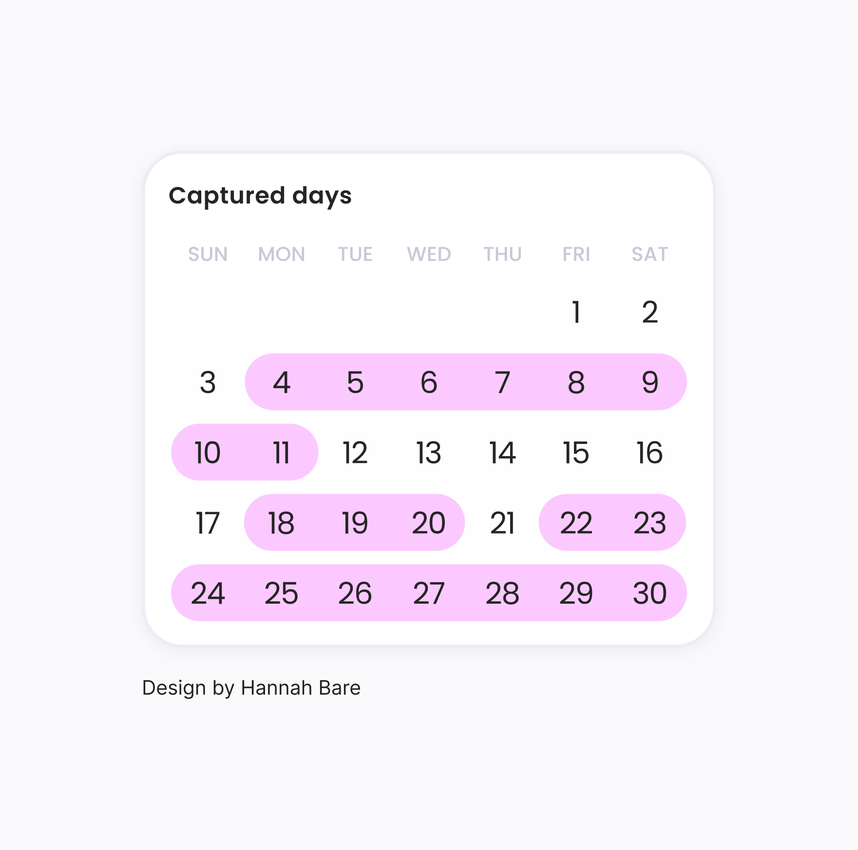
This Diary Study lasted 7 days for participants and took me 12 days in total to onboard participants in the research and conduct the final interview
Research analysis
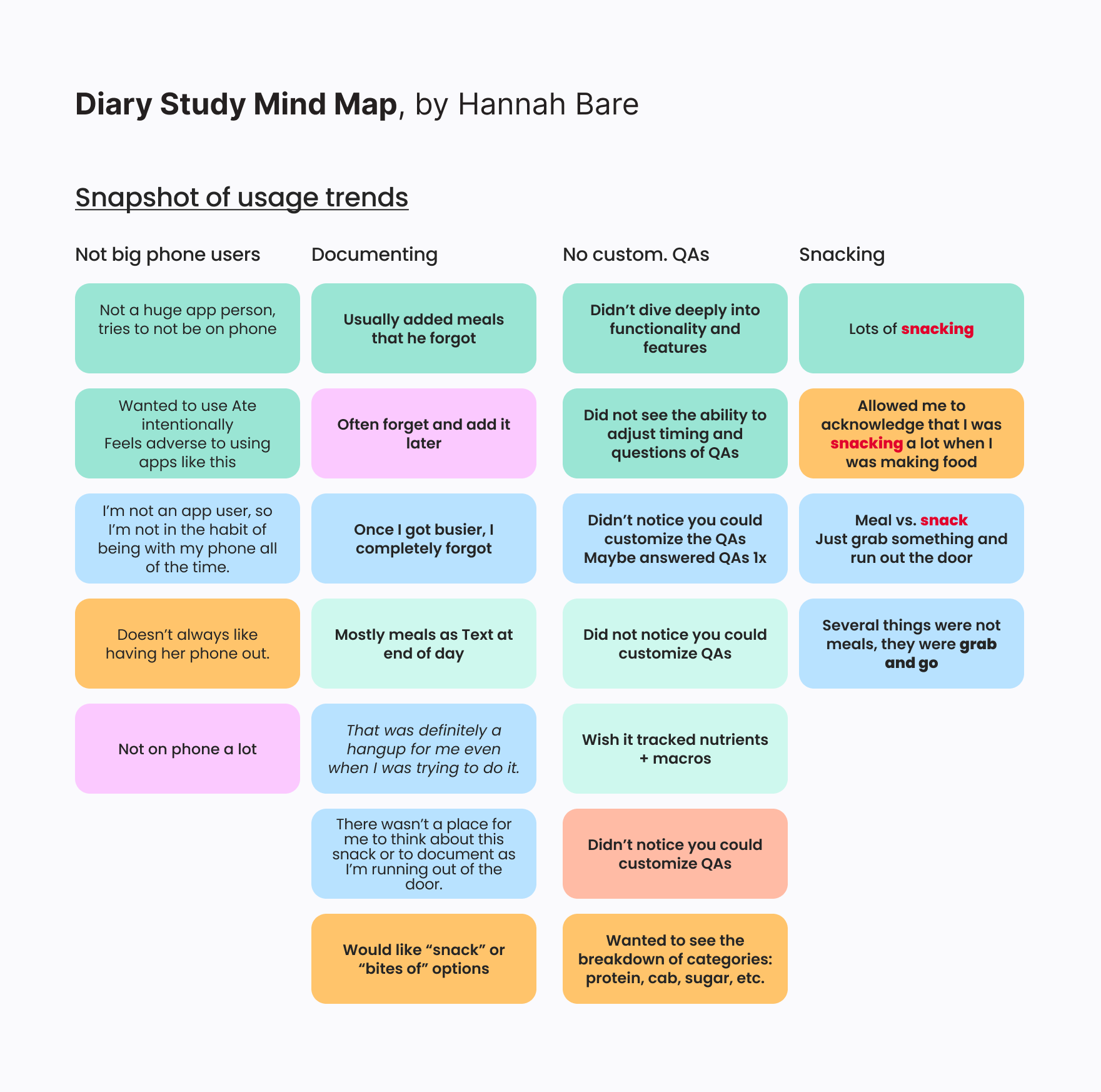
I recruited six participants within our target demographic and interested in food/health. I had them use the app for seven days, completing surveys at each onboarding step and an end-of-day reflection. After seven days, I conducted a final Zoom interview, identifying the following key findings:
Users found the app introduction confusing.
Users expected progress status on their stated goals.
"Experiments" were confusing or underutilized.
Users desired guidance or support for their goals.
Participants didn't use custom questions (important for Insight chart creation).
"Meal as text" was often favored over photos due to aesthetics.

STEP TWO
Synthesize research +
explore ideas
After gathering user analytic data and conducting the qualitative research (Diary Study) I organized, synthesized, and found common themes to use in the information architecture workflow and app design.
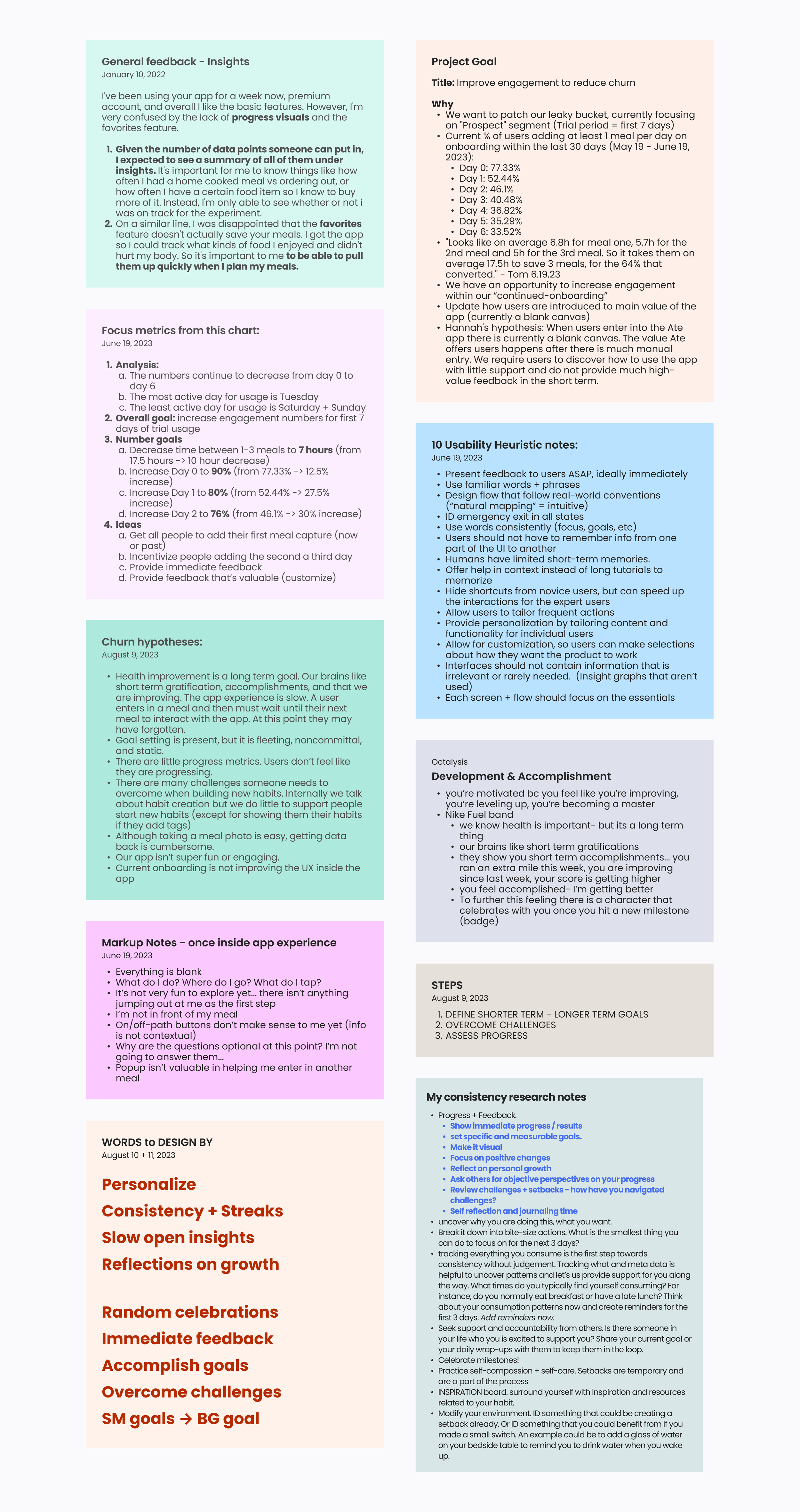
Consolidate gathered data
Below is all of the information I needed to keep in mind as I ideate and create. I consolidated the information to easily to refer back to.
2. Information Architecture workflow
Through the extensive research and distillation of the data, I was able to identified an excellent opportunity to enhance the Ate app’s user experience at the very beginning and ignite their enthusiasm for the app's incredible features. Here are the steps to complete:
Personalize: Tailor the experience to individual goals.
Guide: Introduce the app's functionality contextually.
Engage: Use gamification to encourage usage and fun.
Analysis: With these insights I created an Information Architecture Workflow to help include these key points to increase user engagement and retention.


STEP THREE
Gather feedback +
finalize designs
After I created the Information Architecture Workflow and presented this to team for feedback, I finalized the design mockups for developer hand-off.
FINAL DESIGN PROTOTYPES__________
New onboarding flow.
Maybe you want to turn a hobby into something more. Maybe you want to launch a business.
New in-app experience
Maybe you want to turn a hobby into something more. Or maybe you have a creative project to share with the world.
Final thoughts…
I’m thrilled with the project’s final outcomes. I'm confident that my efforts have synthesized a wealth of research and insights to craft a more impactful onboarding and first 7-day user experience with a strong focus on retention.
While I've achieved a substantial amount, there are additional elements I would have liked to incorporate if time allowed, such as:
Usability test the final designs.
Create a weekly celebration animation.
Integrate Google Material’s “top user benefits” in the onboarding to increase clarity.
Use Diary Study data to continue improving the app.

